The Denver Zoo Redesign
Summary
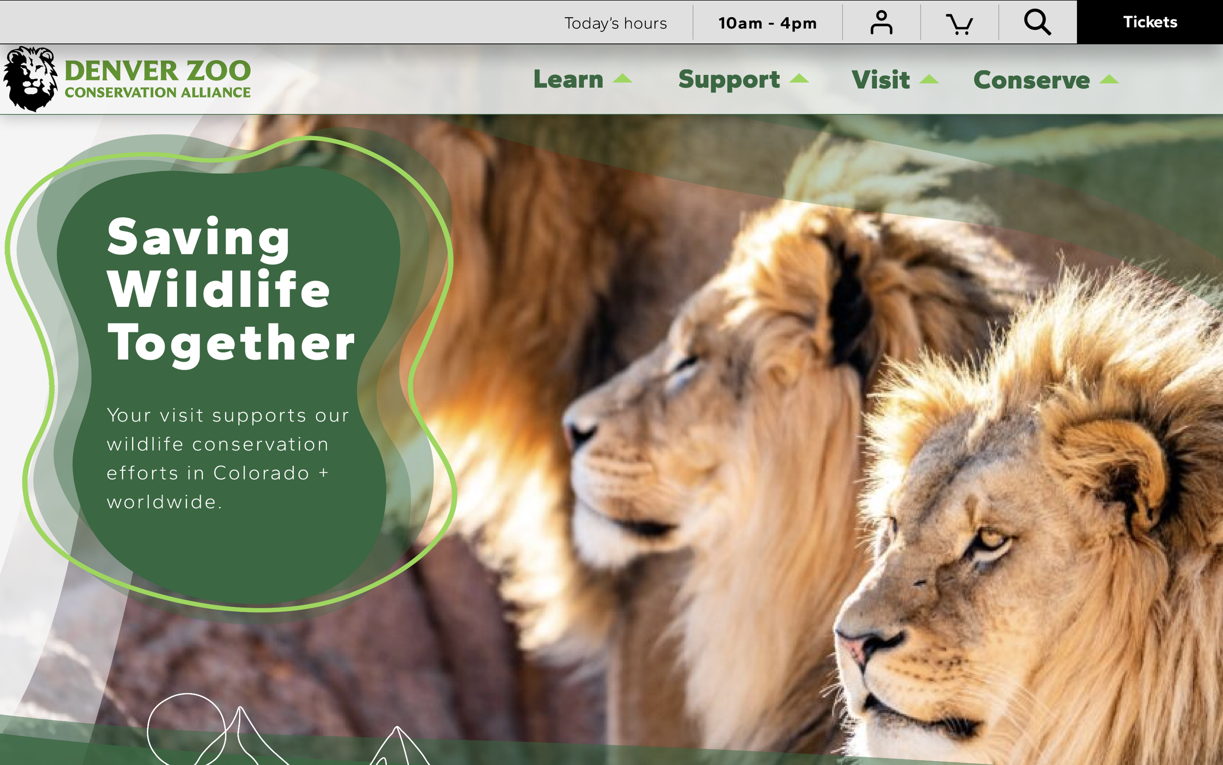
The Denver Zoo is a highly popular place for families visitors and zoo-goers alike to enjoy the grounds and animals for the day. The Denver Zoo website is important for zoo-goers to gain information about the zoo and the events being held and purchase tickets online in advance. I redesigned the Denver Zoo’s website to make it easier for users to purchase tickets and add special events to their cart before going to the zoo.
Challenges / Roll
I was the only designer and redesigned a prototype of the Dever Zoo’s website within Figma, doing usability testing of the original website, making updates, and making multiple prototypes of different fidelity to make it easier for users to go through the purchasing ticket process.
Research
Usability testing
I first took a usability test of the original website from the Denver Zoo. The process included interviewing 5 people who bought tickets through the Denver Zoo’s website. What I discovered by doing this was that a lot of new pages popped up when going through the site. It made it so that each page was unexpected when moving to the next, which was the cause of a lot of frustration
Affinity Mapping
“How might we” Statements
How might we reduce the number of steps to put in Card info
How might we add more info to the enhancements section
How might the enhancement page be made easier to want events on
How might we direct the user to get to the ticket process more efficiently
Y
Competitive analysis
Y
Denver Zoo
N
American Airlines
Y
Denver Aquarium
Flagstaff house
Calendar
Special events/deals
Y
Y
N
N
Different ticket options
Y
Y
N
N
Account log in
N
Y
N
Y
FAQ
Y
Y
Listing consumer options
Y
N
Y
N
Y
Y
Design
Problem statement
For Denver Zoo goers ordering tickets ahead of time online, they need a more efficient way to get through to adding their card and checking out of the page so that they can handle the process and are more likely to purchase tickets.
User flow
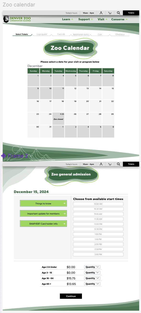
I wanted to ensure that I had the card info section earlier to make the checkout process less grueling and faster. I also wanted to make the flow of each thing something the usability tests expected. I kept the day/time following the calendar
Mid-fidelity
High-fidelity
High fidelity
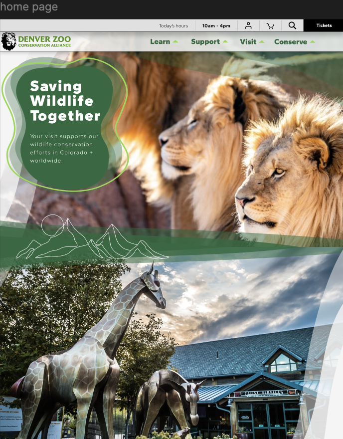
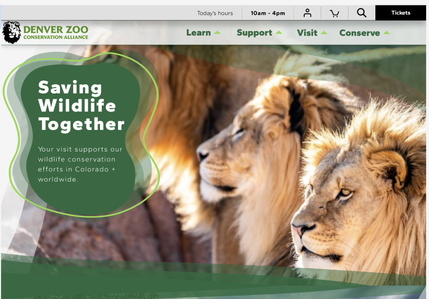
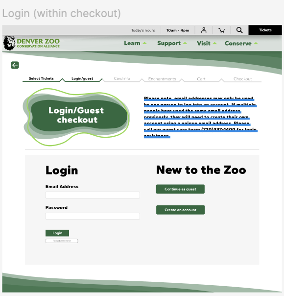
I wanted to make sure I kept the already set branding of the site. The dark greens and the modern tech aesthetic that was playful “zoo” was something that I wanted to keep. I wanted to add a more “Colorado” feeling by adding mountain details in its branding. I tried to keep some of the established layouts but I wanted to simplify some of the layouts to make the flow simpler and shorter
Research
User Testing
I conducted another set of 2 interviews on the prototype design that I made. What I found is that after simplifying the process and reducing the amount of screens that you have to page through, It was easier to navigate through the process of purchasing tickets. I updated the layout of my design. I decided I wanted the card info to be included at the very end of the layout instead of in the middle of the process. I also switched the layout of the cart page, having the purchases at the top and the card info at the bottom.
Reflection
I would like to continue by expanding the site, adding more interactive features and pages to enhance its overall functionality. This will help make the user experience more engaging and dynamic. Additionally, I want to refine the existing interactions, as some of them aren't as smooth or intuitive as I would like. Improving these will help ensure the site feels polished and cohesive. By focusing on both the expansion of new features and the refinement of current ones, I aim to create a more seamless and enjoyable experience for users.
Conclusion
I really enjoyed the process of bringing this project to life. While it was exciting to see it come together, I did find myself frustrated by the numerous steps and iterations required to reach the final outcome. It became clear that the path to completing the project wasn't always linear, and the constant adjustments and revisions took more time than I initially expected. However, despite the challenges, I found it rewarding to dive into the details during the final stages. It was fulfilling to see how small tweaks and refinements could significantly improve the overall result. In the end, though it was a bit of a grind, the sense of accomplishment from seeing the project take shape made it all worthwhile.

